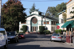
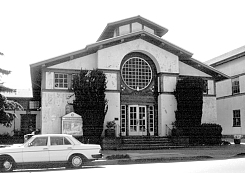
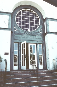
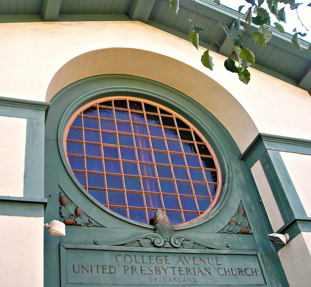
COLLEGE AVENUE
PRESBYTERIAN CHURCH
BUILT IN 1917 By Julia Morgan
“a feeling of warmth & familiarity”
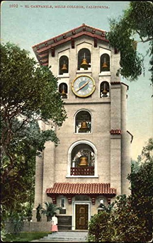
CAPC is blessed to worship in a sanctuary designed by the famous local female architect Julia Morgan. Her services were made possible though the good offices of one of the church’s founding members: Mr. Duncan D. McMillan, a building contractor who had worked for Ms. Morgan on many of her projects, including her work for Mills College and Hearst Castle in San Simeon.
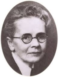
Julia Morgan was born in San Francisco in 1872, and was the first woman to graduate from the University of California’s College of Civil Engineering. Later, she was the first woman architectural graduate of the prestigious École nationale supérieure des Beaux Art in Paris. When she opened her own office, women in the field of architecture were relegated, at best, to interior design.
Julia Morgan fought this prejudice, quietly and with surprising success, by the quality of her work. “Being female has no bearing on my ability as a designer,” she said. Licensed in 1904, one of her first commissions was for Mills College, followed by a decade of commissions there. In an era of rapid growth in the Bay Area, she kept receiving new commissions even though she shunned publicity. Known for the warmth and inviting quality of her designs she built roughly 700 structures, more than 600 of which are in the East Bay alone. Many burned in the 1923 Berkeley fire.
“a combination of triangles, circles, wood, light and paper-thin walls which reflects the personality of the builder and purpose of the structure”
-an excerpt on the architectural characteristics of the CAPC building written by an unknown Bay Area architectural critic
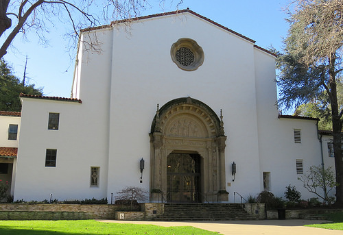
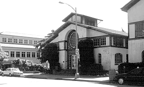
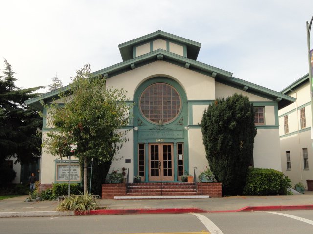
Sometime during the fall of 1916 or the winter of 1917 the congregation of what was then the First United Presbyterian Church of Oakland, decided on newer quarter for their expanding ranks. And so, under the pastorship of Rev. Dr. James F. Ross, then engaged Miss Morgan in January 1917 for the construction of a “one-room frame church” at the intersection of Harwood and College Avenues. The budget allotment for this was a frugal $10,000, a very modest sum even then for a community building.
The matter of the budget, the site and of course the actual appearance of the church all make a cogent statement about the values of the Presbyterians (and of the architect, as well). It is rational, well thought out in its design to hold down cost, and holds a modest though confident posture among the buildings of what was then a busy commercial street. It is clear, straightforward and centralized. The facade has one fundamental geometry - a triangle that begins at the apex of the roof and extends downward on both sides to the street (the attic-like structure on top serves to emphasize this by creating a triangle of its own). Under this umbrella, all the other supportive details
(the rose window, the square-shaped windows) are organized and clearly articulated.
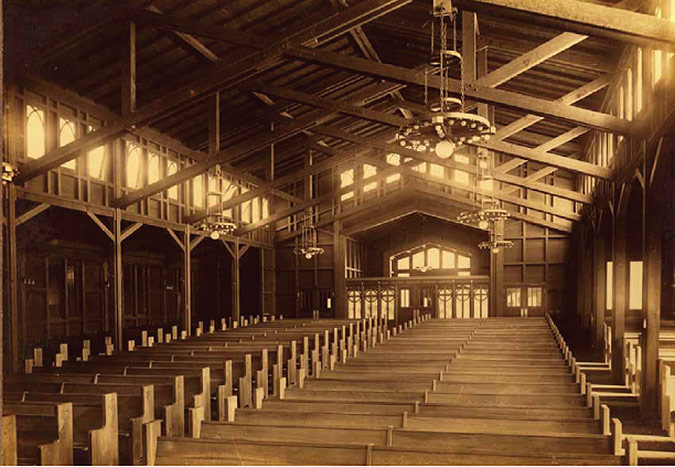
Inside the church, the same logic of parts prevails. The rear wall of the church continues the same rhythm of the exterior, and all parts are clearly (though harmoniously) delineated. There is no display of wealth or dazzlery, but a general spartan posture of “only the essentials”
The first thing that one will notice in approaching the building is that its facade is not axially on any street. Harwood Street runs right into the church but not even here are we right on axis with the building. In addition (and perhaps not surprisingly) the building is fairly low in profile. There are no pinnacles or belfries to call the worshipper to worship (a face that should not be wiped away by the budgetary considerations). In addition, the eaves of the roof are curiously low-raking. The over-all result of these details is a building that does not call attention to itself. and in so doing accepts anonymity. One could conceivably travel south on College Avenue and not take notice of the building.
This low-profile demeanor of the church makes an eloquent statement about both the architect as a person and the Presbyterians - a distrust of the ego, a general forthrightness and seriousness of character, strong humanism. These are certainly aspects of Julia Morgan’s personality, but by coincidence they turn out to be client’s as well. The product of this exchange should (theoretically) come closest to embodying the architects values (a good reason for examining the building).
With this point in mind, general facts about the church do not surprise us. For instance, the
plain, smooth stucco walls and the over-all practicality of all elements of the design.
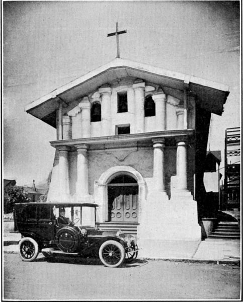
Looking at the building’s facade from College Avenue we are reminded of a number of historical precedents. The plain white stucco walls; the low-raking roof, the generous overhang of the eaves, its rose window - all recall mission architecture.
Missions Delores (1784), for example, has the same low-raking roof; the rose window and other generalized characteristics of the College Avenue Church. Looking at the planar character of the walls, sharply delineated by painted wood members, brings Japanese paper-wood construction to mind.
At this point, one beings to make a list of building types and styles the church recalls. It is then that one realizes that the building does not invoke any one type or style, but a composite.
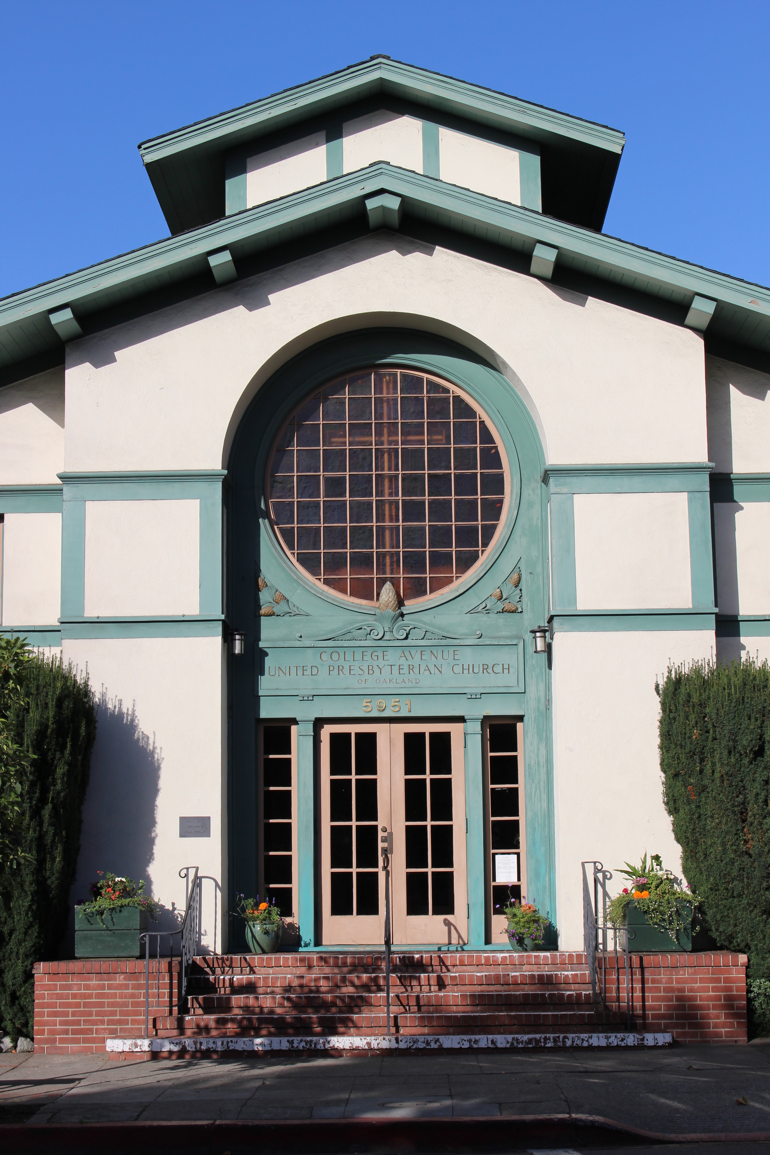

The same low-raking roof has appeared before in the architect’s work (Campanile, Mills College 1904). The over-all form is that of a basilica, with some architectural license, however, for there are not side aisles. Neither is there an apse int he true sense of the word. (this is not unlike the flat-ended cathedrals of medieval England.) At the same time, the facade hints at the basilica and its side aisles through a centralization (achieved by making the building jut out around the door). This device, along with a break in the roof line, recalls the goth cathedral in a loose sense (imagine the two recessed sections of the facade as flying buttresses supporting the central wing).
The exterior, despite an ingenious effort at tying together the diverse (and sometimes conflicting) elements, despite the rationality of easily measured part and a gentle scale, has a remarkably severe quality to it. At a more obvious level, there is the almost “plaster and pietra serena effect” of dark against white. In this case, the share contrast becomes a source of tension and severity. This effect is accentuated by applying a coat of dark paint to all the wood members. The light catching, space-moulding tendency of the wood has all but been denied (and so have the subtle tones and gradations that would soften the view).
We have already mentioned the conflict of one large circular form and the triangular swing of the roof, but there is in addition, the conflict between a church that wants to break its confines and flow out (to fill in the space intimated by the angle of the roof) and the restraining force of the cross at the center of the facade, which acts much like a huge tension ring to tie the church together visually.
If on the outside there is a strange balance between repose and tension, the interior gives us a general feeling of buoyant lightness (which implies unity and minimal conflict), despite the fact that the same materials and effects are employed inside. It would be interesting to speculate why they made a different statement here.
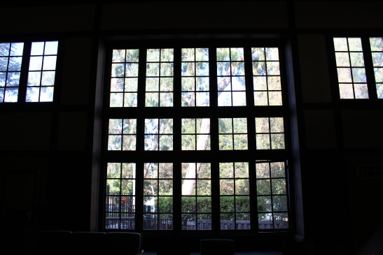
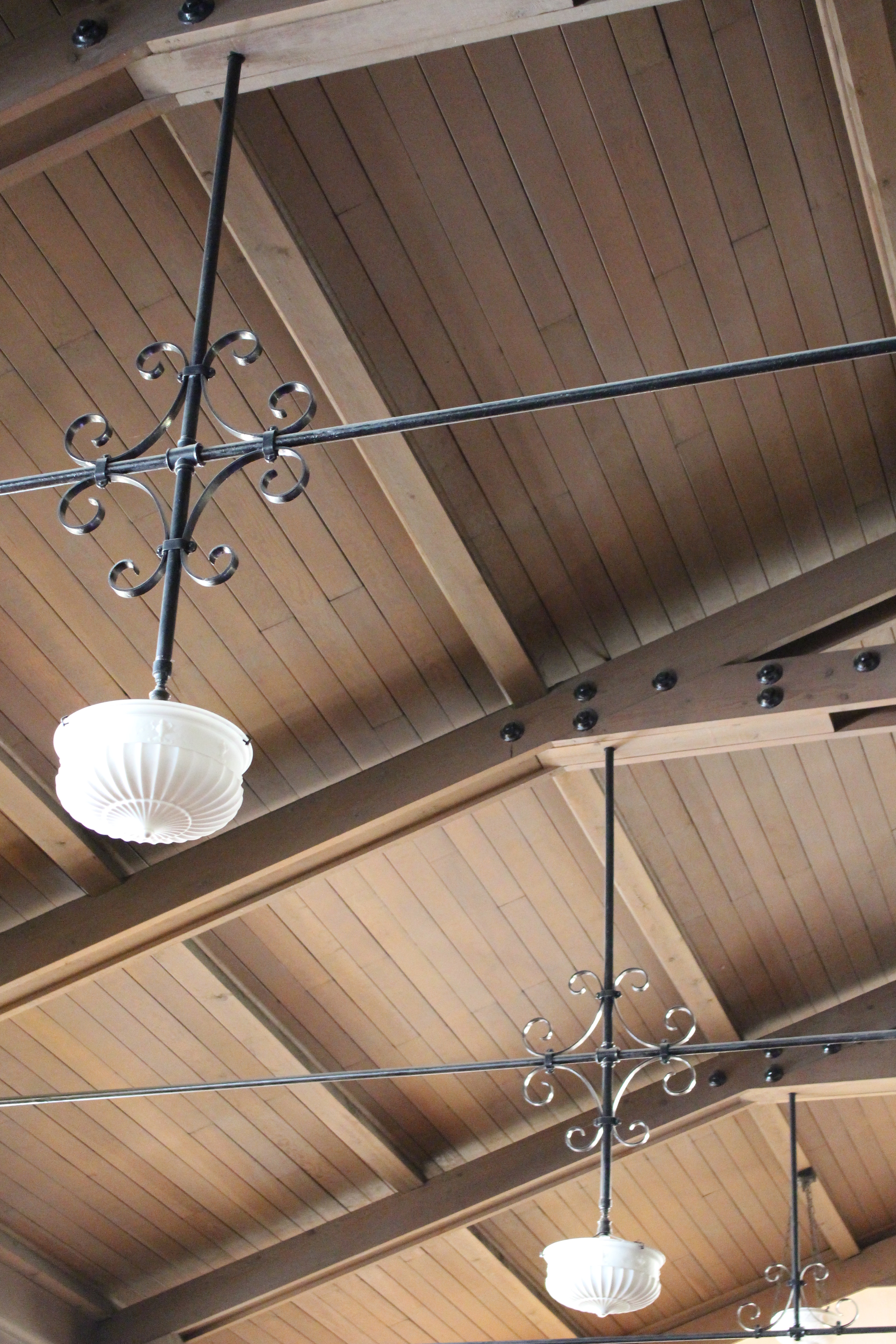
In the rear of the sanctuary there are several substantial horizontal and vertical members to stop our eyes; to cause sharp contrast and tension. This does not seem to stop our eyes from their inevitable movement upward in gentle exaltation. We are not left awe-stricken by the sanctuary’s spatial volumes. Miss Morgan’s very modest interior seeks instead to be a quiet “backdrop” or reinforcement for the contemplation of God. In other words, its function is facilitatory rather than dogmatic. Once again, the issue of subtlety enters our discussion and we must resort to an analysis of details to understand why the church elicits certain emotional responses.
What is it then that causes the “inevitable” movement of our eyes upward? No one factor is of overwhelming significance here: the gentle diffused white light, the delicate tone of the brown-stained wood, the sense of vastness lent by white plaster walls. the wood-beamed ceiling is curiously free of any sense of “mass pulled down by gravity.” The wood members are thin and smooth; gentle in tone. The kingpost that ties the truss and the base together is finely carved (however modestly) to resemble a finial, thereby denying, or at least minimizing, the sense of support (the tie rods do not convey a sense of tension either and look more ornamental than anything else.)
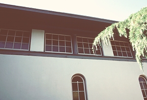
Another aspect of this overall lightness of tone is the use of planar walls - the same planar walls that could be used elsewhere to give a sense of rigidity
delineated by the dark wood members are a direct-line descendant of the paper-wood construction of Japan. Paper is the key word here because the viewer perceives those walls as cardboard thin, and as such, devoid of that feeling of mass present on the building’s exterior.
There is a symmetry that underlies the windows of the church - windows always paired in immediately perceivable numbers - numbers that slip instantaneously into the subconscious to be registered - three, two, and of course five. the logic of this is not unlike that behind the Greek temple, where rarely more than eight columns were used.
The windows on the ground floor of the sanctuary are symmetrical and very simple in design, but magnificently beautiful in their modest way. [Where now stand the organ pipes, added later, was once a massive wall of windows letting in natural light and raising the eyes to the skies.]
Julia Morgan’s work is simple, her almost stern directness of form, minimal ornamentation, create a general elegance and restraint, while managing to be warm and personal at the same time. There is never an element that would overwhelm or disorient us, but consistent effort to remind us of where we are going; of the relationship of one part to the next, but always with the notion of how all parts work as a whole This gives the viewer a comfortable relaxed feeling. There are a number of devices used by Miss Morgan to foster this comfortable “never-overwhelmed feeling.” One of the more obvious ones is the use of a generously intimate scale. Another is a generalized use of symmetrical forms (to facilitate orientation). Another is the choice and combination of materials to give a feeling of warmth and familiarity.